Benchmarks
2018

Words
Hi, Nice to See You!
There are trees, and there is forest. There are anecdotes, and there is data. There are the pinprick pixels of our individual experiences, and there is the vast picture they paint together of the world we share.
The M+R Benchmarks Study is our annual attempt to bridge that divide. This year, we have collected an extensive array of data points from 154 nonprofit participants. Each of them marks a single digital interaction with a supporter: an email opened, a donation made, a petition signed, a website visited, an ad clicked, a Facebook post liked, or tweet retweeted. All told, these add up to 4,699,299,330 email messages, 527,754,635 web visits, and 11,958,385 donations.
It’s a lot of information, and each tiny piece adds a little more clarity to the trends that shape nonprofit digital programs. The averages tell us how nonprofits are approaching digital supporter engagement, and how those supporters are responding. And the outliers tell us where we might be going (or not...sometimes things are just weird). Together they help us dissect our tried-and-true tactics under a microscope to see what makes them tick, and ensure our telescopes are pointed in the right direction to spy the approaching developments that are already impacting our work.
The nonprofits that generously provided the pointilist pigments of this massive portrait represent a wide spectrum of causes, approaches, resources, and relationships. Some are large nonprofits with a hundred years of history behind them and near-universal name recognition; others arrived on the scene just a few years ago to focus on local issues, with a smaller base of dedicated supporters.
Each of them contributed data and answered questions to help us build the largest, most comprehensive dataset we’ve ever used for a Benchmarks Study — which means we can dig into the numbers to discover trends and insights like never before. We know how busy our partners are, and we are massively grateful to every person who took the time and care to provide this information.
The full list of these amazing heroes who we can’t thank enough can be found here.
We would also like to extend our gratitude to NTEN, the Nonprofit Technology Network, and to Salesforce, for helping recruit participants and make sure the Benchmarks findings reach the largest possible audience. Mobile Commons has been an invaluable partner in helping collect and analyze mobile messaging data.
It takes many hands to arrange the many colors of our annual Benchmarks Study into a seamless picture. The M+R data team that compiled and analyzed all this data was led by Theresa Bugeaud and Jonathan Benton, with help from Sam Lichtman, Sammy Stewart, Mohana Kute, Sally Brzozowski, and the many, many M+R staff members who pulled data. Will Valverde was the lead writer, and Karen Hopper, Amy Peyrot, and Liz Ertner contributed insights and expertise. Designers Emily Giorgione and Laura Klavon, along with Anthony Blair Borders and Olivia Moore, made the charts legible and everything lovely. Bobby Burch and Michael King built this website. Lucy Midelfort worked closely with the study participants to collect data, and Bobby Goldstein kept us all working together smoothly. Madeline Stanionis provided guidance through every step of the process.
There are stars, and there is sky.
Each data point in our study is a minute point of light, a small sparkling illumination. We’ve grouped them together into skyspanning constellations, to help you navigate and guide your digital program forward. Together, this data offers a useful outline of the shape of our universe. We’re so glad you’re here — now, let’s go stargazing.


The Big Picture
If all you care about is the view from 30,000 feet, it looks like this: blue skies and clear weather.
Total online revenue grew by 23% in 2017, after 15% growth in the year before. Nonprofits are reaching more people through digital channels than ever before: email lists grew by 11%, a growth rate outpaced by list growth in major social media platforms (Facebook, 13%; Twitter, 15%; Instagram, a whopping 44%).
But look a little closer, and it’s clear that all this good news is not evenly distributed — and there are some clouds gathering on the horizon.
To start with, just about every individual email metric declined:
- Open rates for fundraising and advocacy emails shrank by 1%.
- Fundraising email click-through rates went down 6% (to 0.42%).
- Page completion rates were down 6% for fundraising messages (to 17%) and 4% for advocacy messages (to 76%).
All those figures contributed to declining email response rates. For fundraising messages, response rates dropped to 0.06%; for advocacy messages, response rates dropped to 2.2%.
So: a single fundraising email sent by a nonprofit to a single subscriber was less likely to be opened and less likely to generate a click, an advocacy action, or a donation. That 0.06% response rate means that nonprofits had to send a fundraising message to about 1,667 recipients just to generate a single donation.
But most of the time, we aren’t concerned with the fate of a single message sent to a single supporter, the impact of a single gift. We care about what all those individual touches add up to. Because email lists grew (by 11%), and nonprofits sent more email (11% total growth in messages per subscriber per month, including a 7% increase in fundraising messages), email revenue increased by 24% in 2017 and accounted for 28% of all online giving.
Of course, email is just one thread of the tangled rope that ties supporters to the causes they care about. The messages that land in an inbox may be clicked on less than before, but they are supplemented by hashtags, News Feeds, web visits, banner ads, and more.
Small changes, it is clear, add up to big differences.
It’s that understanding that continues to drive the rapid growth of monthly giving — nonprofits and their donors have increasingly turned to a steady stream of smaller gifts to build sustainable support. Nonprofits received 40% more revenue from monthly gifts in 2017 than 2016, and monthly giving as a share of all online revenue rose from 14% to 16%.
Each visit to a nonprofit website is a singular opportunity to establish or deepen a relationship. These millions and millions of minor interactions add up minute by minute, day by day, over the course of the year.
Overall, 1.0% of nonprofit website visitors joined an email list, and 1.1% completed a donation.
Making the most out of these visits means understanding where supporters are coming from — often literally. Take a look here for details on the move toward mobile and how it’s affecting digital programs.
The most fleeting, ephemeral interactions often take place on social media. Nonprofits build relationships and expand audiences one retweet and one like at a time. Social media audiences continued to grow in 2017, especially on Instagram, where nonprofits ended 2017 with 44% more followers than they had at the beginning of the year.
Tracking these interactions is an increasingly complex endeavor, as each platform makes changes to its algorithms, reporting, and most fundamental features (hello, 280-character tweets!). We’ve developed a few new social media metrics to help make sense of the shifting landscape; see here for more.
From way up high, we see the most important metrics sloping gently upward, with nonprofit online programs rising smoothly. But that view hides the complicated reality of how nonprofits make progress. Ads, social media posts, email messages, website visits… brick by brick by brick, nonprofits are building ever-more complex structures from all of these interactions.
Those details are what you can control, and it’s the small decisions you make each day that change the shape of your digital presence.
Just like real life. Just like everything.


Device Advice: The Move to Mobile
Imagine a potential donor visiting your website. Picture them in your mind as clearly as you can. Close your eyes if that helps you envision them, although that may make it harder for you to read the rest of this.
You might be thinking about individual demographic characteristics — their gender, race, or age, their income level or family status. Contemplate where they live and what kind of job they have. Visualize them. You might consider why they support your cause, whether they’ve taken action with you in the past, whether they landed on a donation page by clicking on a Facebook ad or receiving a fundraising email.
Do you see them clearly in your mind’s eye, ready to give? Good. Now ask yourself this: are they sitting at a desk, typing on a keyboard? Or are they standing in line at a coffee shop, staring at their phone?
If you’re not asking yourself these last crucial questions, you are asking for trouble. Online content is diversifying — across platforms and devices — and nonprofits need to meet their audiences where they actually are.
In 2017, half of visitors to nonprofit websites used desktop or laptop computers. That’s down about four percent from 2016. Meanwhile, the share of mobile traffic increased by 9% and accounted for 40% of nonprofit website visitors in 2017.
The trends here suggest that what we know about digital behavior in general applies to nonprofits as well: mobile traffic will exceed desktop traffic within the next few years — and for some nonprofits, it likely has already. But what we really care about isn’t which device supporters are holding when they visit nonprofit websites — it’s what they do once they arrive.
After reaching a nonprofit’s main donation page, desktop users completed a gift 20% of the time. Mobile users had just an 8% conversion rate, and tablet users were in between at 16%.
Not only were desktop users more likely to complete a gift, but they also gave significantly larger gifts on average than mobile users.
Together, these differences mean that while desktop users represented 50% of the traffic to nonprofit sites, they generated 68% of the donations and 76% of the revenue.
The reasons for these differences are complex and open to interpretation. Supporters may simply be more comfortable pulling out their credit card for a large gift while sitting down at a computer at work or home. Perhaps mobile users are more likely to be consuming nonprofit content on their phones when they’re on the go, resulting in smaller and less frequent gifts. Demographics may also play a role — groups that tend to give at lower rates or make smaller gifts (e.g. younger people) could also be a larger proportion of mobile-first users.
Whatever the underlying reasons, these numbers seem to suggest that desktop users (and the desktop experience) are the most important consideration when developing online content. After all, they are generating the most value. But wait. Let’s look closer at the year-over-year changes.
Everywhere we look, we see the same story: the numbers for mobile users grew, while the numbers for desktop users declined. In some cases, the difference is truly dramatic.
The proportion of transactions from mobile users increased by 50% between 2016 and 2017!
The implications are clear. With the proportion of mobile users set to eclipse desktop users, nonprofits can no longer assume that what works for desktop will translate to a screen 1/10 the size. And as supporters grow more comfortable making gifts on mobile devices, we can’t afford to focus solely on those users with a mouse and a keyboard. If your nonprofit has been thinking about tinkering with website and mobile optimization… it’s time to get serious.
Nonprofit website strategy, design, and content will be a huge factor in the success of online fundraising moving forward. If it’s hard to read and interact with a website, let alone make a donation, users will give up before they’ve even started. And as we are increasingly talking to many audiences, on many devices, with many different user experiences, the cost of ignoring these changes is only going to grow.
DID YOU KNOW?
Mobile devices aren’t just for web browsing! Some people use them for making phone calls, and many nonprofits use them for sending text messages, pictures, video, surveys, and more. Though mobile messaging reaches a smaller audience than email (on average, nonprofits had 84 mobile subscribers for every 1,000 email subscribers), that audience is growing fast. Mobile list size grew by 35% in 2017, and nonprofits sent 1.22 mobile messages per month per mobile subscriber. Special thanks to our friends at Mobile Commons for helping collect this data.


The Speed of Site
It’s easy, if you are constantly thinking about your digital program, to think of it as a continuous, ongoing, seamless thing. And for most of this study, that’s our perspective: we take a step back to look at a year’s worth of data, smoothed out and blended to trace the unbroken topography over time.
But that’s not how supporters experience your organization. Their engagement is particular, not general. They interact with you moment by moment, and each moment matters. When it comes to digital interactions, we must measure in milliseconds.
We found that nonprofit homepages took 3.181 seconds on average to load content visible to the user, while the main donation page on each site loaded in 2.816 seconds.
To put those speeds into context, nearly half of web users expect a website to load in two seconds or less. And research shows that a one-second delay in page load time can lead to an 11% decrease in traffic, and significantly fewer conversions.
Each time a potential supporter clicks through to your website, the clock starts running. If you want to keep them around, displaying content quickly and efficiently is essential — especially considering the increasing percentage of visitors using mobile devices (see here for more on that).
METHODOLOGY NOTE (AND HOW TO RUN THIS ANALYSIS YOURSELF)
Measuring load speed is a subtle science, and there are many slightly different approaches. For this study, we used WebPageTest.org, a Google-supported tool that evaluates several metrics relating to how quickly a web page loads. The specific metric we've used is "Speed Index," which was created via an algorithm that uses both raw numbers and visual renderings (screenshots) of a page to determine when content is first visible to a user.
If you are the kind of person who finds this sort of thing fascinating and wants to know more... then first of all, you are our kind of person! And second, you can see all the nitty-gritty details on our testing process, the exact parameters we used, and how you can measure comparable numbers for your own site here.


Ad Fuel to the Fire
It starts with a single, small, simple question: should my nonprofit invest in digital ads?
Just one! And then suddenly a flood of not-so-small, not-so-simple questions rushes in. What are other nonprofits in our space doing? How much should we invest? What kind of ads — search, social, display? If we do social ads, what platforms? What about content? Audiences? Should we target existing donors? Activists? Prospects? Is our goal list growth, fundraising, branding, visibility, all of the above? Will anybody click on these things? How often? At what cost? What kind of a return should we expect? WHAT HAVE WE DONE?? WHY DID NOBODY TELL ME THIS ENORMOUS CAN IS FULL OF WORMS!?
It can be a lot, especially if your nonprofit is just starting out with a digital ads program, or considering increasing your investment. Let’s walk through the most important questions one at a time.
How much did nonprofits invest in digital ads?
Of the nonprofits that reported spending on digital ads, the average level of investment was $0.05 per dollar in online revenue. To be clear, this is not the return on ad spending (we’ll get to that in a bit); what we are looking at here is the amount a nonprofit spent on advertising relative to its online revenue.
Note: This does not represent return on ad spend; it is simply the ratio of the amount organizations are spending on digital ads to their total online revenue.
So, a nonprofit that received $1 million in online revenue in 2017 might be expected to spend about $50,000 on digital advertising. A nonprofit with annual online revenue of $10 million might average $500,000 in digital ads.
There were some pretty wide differences between sectors in the approach to digital ad spending. Cultural and International nonprofits spent the most relative to online revenue (11 cents per dollar raised), while Hunger/Poverty and Wildlife/Animal Welfare nonprofits spent just 1 cent on digital ads per dollar raised.
Large nonprofits (as measured by email list size) also invested at a higher rate than Medium groups, which in turn invested at a higher rate than Small groups. When we look at year-over-year changes, that gap appears to be shrinking. Small nonprofits reported a 94% increase in digital ad spending.
The average increase in ads investment was 24%; International nonprofits doubled their ad budgets over 2016 levels, while Health nonprofits were the only sector to see a decrease in ad investments.
As you look at your own digital ads strategy, these numbers should help give you a sense of what is “normal” for nonprofits of your size and sector.
What kinds of digital ads did nonprofits buy?
“Digital advertising” isn’t really a single thing — it’s a mix of strategies and media that combine in complex ways.
First, let’s take a look at how nonprofits divided their advertising budgets among the various digital channels.
Social media advertising — including boosted posts and News Feed ads on Facebook, Twitter, and Instagram — claimed the largest share of budgets, accounting for 44% of total ad dollars. The remainder of budgets were split almost evenly between display (e.g. banner ads) and search.
Marshall McLuhan’s theories notwithstanding, the medium is not the message. The message is the message. And nonprofits divided their digital advertising budgets into a few broad messaging categories.
A relatively small portion (10%) of digital ad budgets went toward branding, awareness, or education ads. These are the kind of ads that do not include a direct ask to donate or sign a petition, but might increase the visibility of a nonprofit or a particular campaign or cause. Nonprofits with Large email lists made scant use of these ads, devoting just 5% of budgets to branding. Small nonprofits, on the other hand, invested more than a third of advertising dollars in branding, awareness, and education.
The second broad category is lead generation, which accounted for 25% of digital ad spending. These ads typically drive users to sign a petition, send a letter to lawmakers, take a quiz, sign up for a newsletter, or otherwise take an action that will add their email address and/or phone number to a nonprofit’s list.
The majority of ad dollars were spent on trying to attract donors — nearly two-thirds of budgets were devoted to direct fundraising. These buys included a variety of tactics and audiences, from retargeting users who abandoned donation pages without completing a gift, to promoting emergency-response efforts with display ads, to fundraising social media posts directed at a nonprofit’s own Facebook followers.
How cost-effective were digital ads?
We know how much nonprofits invested in ads, where they placed them, and what they were trying to achieve. So how well did they succeed?
For lead-generation ads, the immediate goal is generating email or phone number sign-ups (secondary goals may include driving donations or increasing social media audience size). On average, nonprofits spent $1.46 on digital ads to acquire one new lead, and we found little variation between sectors.
Converting a donor is quite a bit more expensive than acquiring a new email lead. Display advertising had the highest cost per donation — nonprofits spent an average of $204 in display advertising to generate a single gift. By contrast, search and social media ads had a cost per donation of $41 and $65, respectively.
There were substantial differences between sectors as well. For example, International nonprofits experienced a far higher cost per donation for display and social media ads than Environmental organizations, while search ads had the lowest cost per donation for Wildlife/Animal Welfare nonprofits. It’s unclear whether these differences are due to ad strategy, content, timing, audience targeting, user expectations, or some other factors.
Finally, let’s take a look at return on ad spend (ROAS) — or the amount of revenue directly attributed to an ad for each dollar spent on placement. Search advertising had by far the highest ROAS. For every dollar spent on search advertising, nonprofits generated $3.81 in revenue. Social media ads had an average at about the break-even point, with 97 cents in revenue per dollar in spending. And display ads brought in just 68 cents in revenue per dollar spent (which may be unsurprising given the high cost per donation for this medium).
To be clear, this does not mean that social media or display ads are not revenue-positive — and some sectors may see greater strength in one medium than another. For example, the Wildlife/Animal Welfare sector generated higher ROAS for display ads than for social media. In addition, many donors will have a lifetime value significantly higher than the amount of their initial gift, and you should evaluate the long-term impact of your advertising efforts alongside the immediate return.
The right mix for your nonprofit will depend on a great many factors. Each banner, search term, or promoted post should be evaluated on its own merits and measured against your own goals. So keep asking those relentless questions, keep finding the answers that work for your program, and keep adding pieces to the never-ending puzzle.


Pay Retention to This
You work so hard to acquire new donors — finding the right audience and a way to reach them, crafting compelling fundraising content and a smooth donation process — and once you have them in the door, the last thing you want to do is watch them turn around and walk back out. Retention is essential to a healthy fundraising program.
On average, 38% of donors who made an online gift to a nonprofit in 2016 made an online gift again to that nonprofit in 2017. (This includes monthly donors, who are considered “retained” donors if their regular gifts continue to be processed in the next calendar year.) This result was fairly consistent across sectors — no sector experienced a donor retention rate lower than 35%; the highest retention rates were in the Wildlife/Animal Welfare sector (46%) and the Cultural sector (45%).
One important note: this study is looking strictly at the online retention of online donors. If an offline donor makes another offline gift, or if an online donor responds to a telemarketing call, or if someone buys six boxes of Girl Scout cookies and eats them all by themselves over the course of a single weekend because it’s for a good cause, don’t judge… that won’t be captured here. We’re talking only about online donors who make (or don’t make) a subsequent online gift.
When we separate new donors (those who gave for the first time in 2016) from repeat donors (those who gave in at least one previous year, and also in 2016), a stark difference emerges. First-time donors had an average retention rate of 25%, while repeat donors had a 60% retention rate.
Generosity is a habit, and relationships strengthen over time.
You can expect that a substantial majority of your first-time donors this year, the ones you worked so hard to acquire, will not return to make a second gift next year. But those who do, those who renew their commitment to your cause, are more likely to come back again and again. These dedicated donors are the backbone of your fundraising program, the reliable revenue your nonprofit needs to develop long-term sustainable growth.
Acquisition is a never-ending struggle, and nonprofits are constantly asking themselves how to secure that crucial first gift. Given the high retention rate of repeat donors, developing strategies to get a second gift and build a long-term donor relationship could make a world of difference.


Settling the Social Media Score(s)
On the surface, social media is all about detail. You can keep track of your sister’s friend’s child’s day-to-day development from birth through second grade, tweet your reaction to each unfolding twist on RuPaul’s Drag Race, Instagram breakfast, lunch, and dinner. So much detail!
And yet, with the near-infinite sea of data points constantly churning through the servers at social media platforms, going deeper than that surface level can be extremely challenging. It’s easy enough to tally up followers and likes — but to guide your social media strategy, you need to dig a bit deeper.
The algorithms that determine who sees what content when are opaque and impenetrable, so we use a variety of metrics to assess social media post performance, especially for Facebook. We introduced a new metric, Earned Reach Average, in our Benchmarks Study last year. This time around, we have some new ways to help you peer deeper into the details. Let’s zoom in.
Reach your children well
The first thing you need to know is who is seeing your posts. The second thing you need to know is who is not seeing your posts.
For any given Facebook post in 2017, 38% percent of the audience reached was not already following the nonprofit. That means that a substantial number of users who see your Facebook content may not have any previous connection to your nonprofit or your cause. It’s important to make sure that you are speaking to this audience as well as those who are more familiar with your work.
And those folks who are familiar with you, who follow you because they care about your cause and value your mission? Facebook isn’t showing most of your posts to most of those people. On average, each post a nonprofit made on Facebook only reached 7% of its fans in 2017.
There is a balance here between the existing followers who Facebook allows to see your post, and those who are not yet followers but might be interested in your content. Together those audiences combine to generate the Earned Reach Average. This is the ratio of reach to followers.
Visit http://www.mrss.com/lab/earned-reach-average/ to learn more.
On average, any given post reached 112 people total for every 1,000 followers. So a post by an organization with 50,000 followers would reach just 5,600 people. Hunger/Poverty nonprofits fared quite a bit above average, reaching 217 Facebook users per thousand fans; International and Cultural nonprofits had lower ERA: 0.065 and 0.077, respectively.
We understand if this feels a bit discouraging — simply having a large number of Facebook followers isn’t enough to make sure your content is seen by large audiences. But don’t despair. When quantity of followers isn’t a guarantee of widespread reach, it simply means that quality of content matters more than ever.
Let’s get engaged!
While Facebook’s algorithms remain an impenetrable black box for the most part, we do know that the most engaging posts tend to spread further and earn greater reach.
Facebook does provide a way to measure this (Engagement Rate, the ratio of engaged users to post reach). It’s just not a very good way, as it can give you a skewed perspective on your post performance. The problem is that engagement and reach are not independent variables — high engagement can lead to greater reach. So if we are dividing (Engaged Users)/(Reach), a successful post makes the denominator bigger, and can produce a misleadingly low Engagement Rate. On the other hand, a post with mediocre engagement can have quite a high Engagement Rate, just because it didn’t actually reach that many people.
Instead, we use Engagement Score as our benchmark for how engaging a post is; it measures the number of people a post engages (Engaged Users) divided by a nonprofit’s Total Facebook Fans. Posts that engage more users generally tend to have more Reach, and Engagement Score is the way to compare yourself to organizations of different sizes.
Facebook Engagement Score = Total Engaged Users / Total Page Fans that day
Facebook Engagement Score tracks more closely with the reach a post gets, and can be readily compared between organizations with audiences of different sizes.
The 0.44% overall average Engagement Score means that for a nonprofit Facebook page with 10,000 fans, an average post has 44 people interact with it via a click, reaction, share, or comment. This is a baseline you can use to compare how successful your posts are at engaging users, which will affect clicks, reach, and all the other most important metrics.
Of course, not all Facebook content is created equal. We found that video posts tend to have higher Engagement Scores than link or photo posts.
While the differences in Engagement Score on different days of the week were small, content posted on Saturday and Sunday had the lowest levels of engagement.
But wait, there’s more scores
Engagement Score is an aggregate measure, and includes a variety of ways for users to interact with your social media content. That means it hides some of the detail, and it’s often the detail that determines the most effective strategy. So let’s drill one level deeper to see what we find.
The Clap Score is the number of Likes a post received divided by the number of fans a nonprofit’s Facebook page had that day. (Facebook still calls them “Likes” even though it now allows you to laugh, love, cry, be shocked, or make that angry red face.) This is the lowest-bar engagement on Facebook, and should give you a sense of how many people feel some emotional response to your content.
The Talk Score is the number of Comments a post received divided by the number of fans a nonprofit’s Facebook page had that day. Because commenting is not as quick and easy as simply liking content, Talk Score tends to be quite a bit lower than Clap Score — but it also is given more weight by Facebook’s algorithm, so a high Talk Score can help drive greater reach. If your goal is to foster real conversations and deep engagement about your issues, this is the metric you’ll want to hone in on.
The Share Score is the number of Shares a post received divided by the number of fans a nonprofit’s Facebook page had that day. Creating content that your existing supporters find irresistibly shareworthy is the most effective way to get your nonprofit or cause in front of new social media audiences (other than paid promotion, of course).
Depending on your goals, you might be most eager to generate likes, comments, shares, or reach. Your program’s priorities may change over time, or be specific to a given post. None of these should be seen as the most important measure, any more than any single piece of a jigsaw puzzle is the most important. They all work together to create a successful, thriving, effective social media program. By getting the details right, you can make the big things happen.
Sector Breakouts
Closer Look: Cultural Sector
We put data from participants in the Cultural Sector under the microscope. These are the most important metrics where their results varied from other sectors.
- Cultural nonprofits had the highest investment in digital ads, spending $0.11 per dollar of online revenue, compared to an overall average of $0.05.
- Website visitors to Cultural websites were the least likely to complete a gift. Just 0.3% of website visitors donated; the overall average was 1.1%.
- On the other hand, 1.8% of visitors to Cultural websites signed up for email, the highest rate of any sector.
- Cultural nonprofits had particularly high fundraising email open rates (23%, compared to a 15% average); strong click-through rates (0.58%, compared to a 0.42% average); and very low donation page completion rates (11%, compared to a 17% average). All of this added up to a response rate of 0.07%, just above the overall average of 0.06%.
- Cultural nonprofits had by far the largest social media audiences relative to email list size. For every 1,000 email addresses, they had 1,924 Facebook fans, 722 Twitter followers, and 599 Instagram followers.
Closer Look: Education Sector
We put data from participants in the Education Sector under the microscope. These are the most important metrics where their results varied from other sectors.
- Education nonprofits had the fastest donation page load speed. Donation pages for this sector took an average of 1.896 seconds
to load user-visible content, compared to the 2.816 seconds overall average. See here for more on this metric and why it matters. - Emails from Education nonprofits had among the highest open rates: 19%, compared to the overall average of 16%. Only email from the Hunger/Poverty sector had a higher average open rate (22%).
- The Education sector experienced the highest average unsubscribe rate of any sector (0.21%, compared to a 0.16% overall average).
Closer Look: Environmental Sector
We put data from participants in the Environmental Sector under the microscope. These are the most important metrics where their results varied from other sectors.
- The Environmental sector had the lowest cost per donation for display ads ($42 per donation, compared to an overall average of $204), and for social media ads ($24 per donation, compared to a $65 average). These lows did not hold true for all ad types: the $50 cost per donation for search ads was a bit higher than the $41 overall average.
- Environmental nonprofits had the highest return on ad spend (ROAS) for social media ads ($1.48, compared to a $0.97 overall average). For display ads, this sector had the lowest ROAS ($0.28, compared to a $0.68 average).
- Environmental nonprofit websites experienced the greatest increase in website visitors per month: 3.9% growth over the 2016 level, while the overall average was a 1.4% decline.
- The main donation page conversion rate for Environmental nonprofits dropped by 16% in 2017, while the overall average change was a 5% increase.
- Email subscribers to Environmental nonprofits took action at higher levels than any other sector: 29% of subscribers completed an advocacy action at least once in 2017 (compared to a 21% overall average); and 8% of email subscribers took action 3 or more times (compared to a 6% average).
- Environmental nonprofits sent more email messages per year per subscriber than any other sector: 89 emails in 2017, compared to an overall average of 66. Although the overall email volume was highest for this sector, it did not lead in any individual email category (fundraising, advocacy, newsletter, or other).
- Monthly giving revenue increased at an exceptional rate for Environmental nonprofits, growing by 67% compared to the overall 40% growth rate. One-time giving revenue growth for Environmental nonprofits was in line with other sectors.
- Environmental nonprofits received the smallest average gift for monthly giving: $15 for monthly giving sourced to email (compared to an $18 overall average), and $19 for non-email monthly giving (compared to a $25 average).
Closer Look: Health Sector
We put data from participants in the Health Sector under the microscope. These are the most important metrics where their results varied from other sectors.
- Social media ads from Health nonprofits had the highest cost per donation ($185, compared to an overall average of $65).
- While the average budget for digital ads across all sectors increased by 24% in 2017, Health budget actually decreased 42%.
- Health nonprofits had by far the highest unsubscribe rate for advocacy emails (0.22%, compared to an overall average of 0.12%, with no other sector higher than 0.14%). Advocacy email click-through rates were the lowest for the Health sector (1.2%, compared to an average of 2.5%), with no other sector lower than 2.0%.
- Just 2% of Health nonprofit email subscribers completed an advocacy action 3 or more times, compared to an overall average of 6%.
- Health nonprofits have seen rapid growth in email revenue over the past two years. From 2015-2016, email revenue increased by 53% (compared to a 19% average), and from 2016-2017, email revenue grew by 41% (compared to a 24% average).
- Health nonprofits had the lowest email volume, sending 38 messages per subscriber per year compared to an overall average of 66. They sent the fewest fundraising messages per subscriber per year as well, just 6 appeals compared to an average of 25.
- Social media audiences grew at particularly low rates for Health nonprofits: 10% growth in Twitter followers was the lowest of any sector, and 8% growth in the number of Facebook fans was well below the 13% overall average.
Closer Look: Hunger/Poverty Sector
We put data from participants in the Hunger/Poverty Sector under the microscope. These are the most important metrics where their results varied from other sectors.
- The Health/Poverty sector reported divergent revenue growth by donation type. This sector had the lowest growth in one-time revenue (15%, compared to an overall average of 19%), but relatively large increase in monthly giving revenue (49%, compared to a 40% average).
- The average non-email online donation to Hunger/Poverty nonprofits was $169, well above the overall average of $113.
- Hunger/Poverty nonprofits also received the most revenue per 1,000 fundraising emails delivered: $138, compared to an overall average of $42.
- Email lists grew by 19%, ahead of the overall average (11%). This is a remarkable change for Hunger/Poverty nonprofits, which saw 1% declines in email list size in 2015 and 2016.
- Hunger/Poverty nonprofits had the lowest investment in digital ads relative to online revenue: $0.01 per dollar raised online, compared to an overall average of $0.05 per dollar raised.
- Hunger/Poverty nonprofits had by far the highest fundraising page completion rate: 28%, compared to an average of 17%.
- The Hunger/Poverty sector was the only sector with more Twitter followers (579) than Facebook fans (466) per 1,000 email addresses. This distinction was driven in part by 42% growth in the number of Twitter followers, compared to an average of 15%.
- Hunger/Poverty nonprofits had the highest score for all Facebook engagement metrics, including Earned Reach Average (0.217 compared to 0.112 average), Engagement Score, Clap Score, and Talk Score.
Closer Look: International Sector
We put data from participants in the International Sector under the microscope. These are the most important metrics where their results varied from other sectors.
- International nonprofits composed the only sector to see a decline in revenue from 2015-2016 (a 9% decline, compared to an overall average of 15% growth). From 2016-2017, revenue for these groups increased by 15%.
- The International sector retained just 20% of new donors, compared to an overall average of 25%. However, the sector’s prior donor retention rate of 60% is in line with the overall average.
- International nonprofits increased ad spending by 100% over 2016 levels. They had the highest investment in digital ads relative to online revenue, spending $0.11 per dollar raised online, compared to an overall average of $0.05.
- This sector had the highest cost per donation for all ad platforms: $332 for display ads (average: $204); $62 for search ads (average: $41); and $124 for social media ads (average: $65). Despite these relatively high costs, return on ad spend for the International sector was close to average for all ad types.
- International nonprofits received $4.11 per website visitor; no other sector had an average higher than $1.09. The percentage of website visitors who made a donation for the International sector was also an outlier: 3.2% of website visitors made a gift, compared to the 1.1% average.
- The International sector sent the most fundraising messages per subscriber per year: 45, compared to an overall average of 25.
- Donors driven by email made particularly high average gifts to International nonprofits. The average email monthly gift was $27 (compared to an $18 average), while the average email one-time gift was $124 (overall average: $76). Non-email average gifts for this sector were also significantly higher than average.
- Revenue per 1,000 fundraising emails delivered increased 40.2% for the International sector, compared to overall average growth of just 1.7%.
- The International sector was the only sector to see a decline in email list size (an 8% drop, compared to average growth of 11%). This could be related to the sector’s industry-leading churn: a bounce rate of 15.7% (average: 10.0%), and an unsubscribe rate of 9.2% (average: 7.6%).
Closer Look: Public Media Sector
We put data from participants in the Public Media Sector under the microscope. These are the most important metrics where their results varied from other sectors.
- In what may be the least shocking finding of this entire Benchmarks Study, Public Media nonprofits sent by far the highest volume of newsletter emails: 40 newsletter emails per subscriber per year, compared to an overall average of 12.
- Public Media nonprofits saw a 74% increase in main donation page conversion rate, far exceeding the overall 5% increase. Despite that growth, this sector still had the lowest main donation page conversion rate, 12%, compared to an overall average of 17%.
- Just 0.4% of visitors to Public Media websites signed up for email, compared to an overall average of 1.0%.
- New donor retention for Public Media dropped sharply, by 15.3%, while the industry average was an increase of 1.3%. However, Public Media new donor retention was still 27%, close to the overall average.
- Public Media nonprofits received $104 in revenue for every 1,000 fundraising emails delivered, compared to an overall average of $42.
- The Public Media sector received just 10% of online revenue from email, the lowest share of any sector and well below the overall average of 28%.
- Public Media email list size grew by 41%, compared to an average of 11%.
- The 27% increase in the number of Facebook fans for Public Media nonprofits was well above the overall average of 13%. On the other hand, this sector had the smallest increase in Instagram followers, 28% compared to the overall 44% average.
Closer Look: Rights Sector
We put data from participants in the Rights Sector under the microscope. These are the most important metrics where their results varied from other sectors.
- The Rights sector had the lowest cost per donation for search ads, just $26 compared to the overall average of $41, as well as the lowest cost per digital ad lead, $1.33 compared to the overall average of $1.46.
- Rights nonprofits received the lowest revenue per visitor, by a significant margin: just $0.31 per visitor, compared to an average of $1.13. No other sector was below $0.70. This was despite a 51% increase in the percentage of website visitors making a gift; 0.9% of website visitors donated, just a bit below the 1.1% average.
- The Rights sector saw the largest increase in online revenue from both 2015-2016 (29%, compared to an overall average of 15%), and 2016-2017 (37%, compared to an overall average of 23%).
- This sector also saw the largest increase in the number of online gifts: a 58% increase from 2016, compared to an overall average increase of 28%.
- One-time gifts driven by email were especially small for Rights nonprofits ($53, compared to an overall average of $76). On the other hand, the non-email average gift size for the Rights sector was $133, higher than the $113 industry average.
- Monthly giving made up 24% of all online revenue to Rights nonprofits in 2017, higher than the overall average of 16%.
- Rights nonprofits received just $21 per 1,000 email delivered, compared to a $42 average.
- The Rights sector sent the highest volume of advocacy email: 32 emails per year per subscriber, compared to an overall average of 17. Advocacy emails accounted for 46% of all Rights sector email messages.
- Rights nonprofits were the most active on Facebook and Twitter. They posted 2.3 times per day on Facebook (overall average: 1.5 posts per day), and tweeted 6.9 times per day (overall average: 3.3 tweets per day).
Closer Look: Wildlife/Animal Welfare Sector
We put data from participants in the Wildlife/Animal Welfare Sector under the microscope. These are the most important metrics where their results varied from other sectors.
- Wildlife/Animal Welfare nonprofits invested just $0.01 in digital ads for every dollar they received in online revenue, well below the $0.05 per dollar average.
- Wildlife/Animal Welfare nonprofits saw a positive return on ad spend (ROAS) for display ads ($1.15), search ads ($3.16), and social media ads ($1.10).
- Websites for Wildlife/Animal Welfare nonprofits had the longest load times on desktop of any sector. Homepages loaded in 4.694 seconds (compared to an overall average of 3.181s). See here for more on website page load speeds and why they matter.
- The Wildlife/Animal Welfare sector had the highest overall online donor retention at 46%, compared to an average of 38%. Prior-year donor retention for this sector was 64% (compared to a 60% overall average), and new donor retention was 34% (compared to an overall average of 25%).
- Monthly giving accounted for 23% of all online revenue for Wildlife/Animal Welfare nonprofits, well above the 16% average — but this was the only sector whose monthly giving as a percentage of overall revenue was lower in 2017 than 2016.
- Wildlife/Animal Welfare nonprofits received the highest share of online revenue from email: 57% of online revenue was sourced to email, compared to an overall average of 28%.
- Wildlife/Animal Welfare had the best fundraising email response rate of any sector (0.09%, compared to the overall average of 0.06%). This was driven in part by a fundraising email click-through rate of 0.70%, well above the overall average of 0.42%.
- Wildlife/Animal Welfare also had the highest reponse rate for advocacy emails: 3.8%, compared to an average of 2.2%. As with fundraising email, Wildlife/Animal Welfare nonprofits had a very high advocacy email click-through rate (4.9%, compared to an overall average of 2.5%).
- Just to round it out, the Wildlife/Animal Welfare sector had the highest newsletter click-through rate (2.5%, compared to the 1.4% average).
Numbers
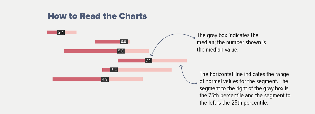
How to Read the Data
So many individual data points went into our Benchmarks Study this year, a flurry of snowflakes that built up into a blizzard. The charts on the following pages include input from 154 wonderful nonprofit partners across nine different sectors.
To help you find the individual information that will be most useful to you, we have broken out the findings by sector and group size wherever possible. If you’re not sure which sector applies to you, take a look at the full list of participants, find your closest peers, and you’ll find where you belong.
For our study, “Small” refers to nonprofits with email list size below 100,000; “Medium” includes those nonprofits with email lists between 100,000 and 500,000 subscribers; and “Large” covers all those with email audiences over 500,000.
That’s important when it comes to identifying the most relevant data on our charts, but what is true on Dagobah is true on Earth: size matters not, and we are so grateful to every participant of every size and sector who helped make this study possible.
Not all participants were able to provide data for every metric. In places where a chart does not include data for a certain sector or size, it’s because we were not able to collect enough results to report a reliable average.
As much as each data point is a beautiful, unique snowflake, so is each year’s Benchmarks Study. Because our pool of participants changes from year to year, putting this year’s numbers side by side with previous editions would be like comparing aardvarks and orangutans. Don’t do it. Instead, wherever possible, we’ve included year-over-year data from our current pool of participants.
Fundraising
The Great Big Giant Details
- Overall online revenue increased by 23% in 2017, accelerating from 15% growth the previous year. Every sector we tracked saw at least 15% online revenue growth, with particularly large gains for Environmental (34%) and Rights (37%) nonprofits. Nonprofits in our study received an average of 28% more online gifts in 2017 than 2016.
- Revenue from one-time gifts increased by 19%, while monthly giving revenue increased by 40%. Monthly giving accounted for 14% of all online revenue in 2016, and 16% of online revenue in 2017.
- Email messaging drove 28% of all online revenue in 2017. The Public Media sector received the lowest share of revenue from email (10%), while 57% of online revenue for Wildlife/Animal Welfare nonprofits was driven by email. Email revenue grew at a slightly higher rate than overall revenue in both 2016 and 2017 (19% and 24% growth, respectively).
- For every 1,000 fundraising messages sent, nonprofits raised $42. There were noticeable differences in this metric by nonprofits' size. Small nonprofits (under 100,000 email subscribers) received $71 per 1,000 fundraising emails sent; Medium nonprofits (100,000–500,000 email subscribers) received $36; and Large nonprofits (over 500,000 subscribers) received $32.
- On average, 38% of donors who made an online gift to a nonprofit in 2016 made an online gift again to that nonprofit in 2017. Retention was 25% for donors who made their first gift in 2016, and 60% for repeat donors (who gave at least one gift before 2016, and again in 2016). See here for the full story on retention.
Email Messaging
The Great Big Giant Details
- Email list size increased in 2017, but at a slower rate than previous years. In 2015, lists grew by 15%; in 2016, by 14%; in 2017, by 11%. Public Media nonprofits saw 41% growth in list size in 2017, while International was the only sector to experience a decline (a change of -8%).
- Nonprofits sent an average of 66 email messages per subscriber in 2017. This marked an 11% increase in volume from 2016. The largest category of email messages was fundraising (25 emails per year per subscriber). Environmental nonprofits sent an average of 89 emails per subscriber, the most of any sector; the Health sector had the lowest volume, with 38.
- Advocacy email response rate declined by 9% in 2017, to 2.2%. Small drops were reported for open rate (down 1% to 15%), click-through rate (down 1% to 2.5%), and page completion rate (down 4%, to 76%). The unsubscribe rate fell to 0.12%, 13% lower than in the previous year.
- Fundraising email response rate declined by 6% in 2017, to 0.06%. As with advocacy messages, small drops were reported for open rate (down 1% to 15%), click-through rate (down 6% to 0.42%), and page completion rate (down 6%, to 16%). The unsubscribe rate fell to 0.18%, 3% lower than in the previous year.
Overall Email Metrics
Fundraising Messages
Advocacy Messages
Web Engagement
The Great Big Giant Details
- Nonprofits raised $1.13 per website visitor in 2017. International nonprofits raised the most, $4.11 per visitor, while the Rights sector had the lowest revenue per visitor at $0.31. Overall, 1.1% of website visitors made a donation, an increase of 18% over 2016.
- Website traffic declined slightly in 2017, with 1.4% fewer visitors per month. The Education, Environmental, and Health sectors were the only ones to report an increase in website visitors per month.
- Half of nonprofit website traffic came from mobile and tablet users. Mobile accounted for 40% of all visitors, tablets for 10%, and desktop users made up the other 50%. The share of mobile traffic increased by 9% from 2016, while the share of visitors using desktop or laptop computer declined by 4%. See here for an in-depth look at performance by device type.
- Nonprofit homepages took an average of 3.181 seconds to load, while donation pages took 2.816 seconds to load. See here for more details on page load speed and why it matters.
Next Steps
Benchmark Yourself
| Fill in | Your Benchmarks | Benchmarks 2018 |
|---|---|---|
|
|
00%
Open Rate
00%
Click-Through Rate
00%
Response Rate |
15%
Open Rate
0.42%
Click-Through Rate
0.06%
Response Rate |
|
|
00%
Open Rate
00%
Click-Through Rate
00%
Response Rate |
15%
Open Rate
2.5%
Click-Through Rate
2.2%
Response Rate |
|
|
00%
Increase in Online Revenue
$00
For every 1,000 Fundraising Emails Delivered, Your Org Raised
$00
For every 1,000 Website Visitors, Your Org Raised |
16%
Increase in Online Revenue
$42
For every 1,000 Fundraising Emails Delivered, Nonprofits Raised
$1130
For every 1,000 Website Visitors, Nonprofits Raised |
Please ensure your Organization and Email are entered and valid.
Infographic
Email & Mobile
We analyzed
Here's what we saw:
| Email Fundraising | Email Advocacy | |
| Open Rate | 15% | 15% |
| Click-Through Rate | 0.42% | 2.5% |
| Response Rate | 0.06% | 2.2% |
| Drop in Response Rate from 2016-2017 | -6% | -9% |
Emails sent per month, per subscriber
| 5.3 Cultural | 8.3 Environmental | 2.4 Health |
| 6.0 Hunger / Poverty | 5.8 International | 7.4 Public Media |
| 5.4 Rights | 4.9 Wildlife / Animal Welfare |
Fundraising & Donor Retention
We analyzed
Here's what we saw:
Average Email Gift
Online donor retention
Social & Ads
For every 1,000 email subscribers, nonprofits have:
In 2017, here's how nonprofits divvied up their digital ad budgets:
| Goals | |
| Branding, Awareness, Education | 10% |
| Lead Generation | 25% |
| Direct Fundraising | 63% |
| Other | 2% |
| Channels | |
| Display Ads | 25% |
| Search Ads | 28% |
| Social Media Ads | 44% |
| Other | 3% |
Cost Per Donation
Return per $1 of Ad Spend
Sign Up for Next Year
Benchmarks Study participants are wonderful, generous, smart people who know how much data matters to the causes they care about. Did we just describe you, too? Then sign up to participate in next year’s study!
You don’t have to commit now — just let us know you might be interested in helping make our data set as comprehensive and useful as possible. We’ll follow up with all the details (and no icky sales pitches — we really just want to make Benchmarks awesome, and we need folks like you to help us do that).
Yes! I love data and/or fundraising and/or advocacy and/or marketing and/or jokes about all of those things. I am interested in participating in the next M+R Benchmarks Study. I know I’m not committing to anything yet, but I’d like to get in touch about how to participate.
Details
About
M+R is 140 smart people who mobilize supporters, raise money, and move the media, the public, and decision-makers to help nonprofits achieve real, lasting change. We only work with clients we believe in. We take risks. We work hard. We do all the little things that add up to great, big change. We’re leaders, we’re organizers, and we don’t stop until we win.


Methodology
Our guiding light in developing each annual Benchmarks Study is to make it as comprehensive, useful, precise, and transparent as possible (we even put holes in this year’s print version!). So, to make sure you understand not just the final picture but how it was developed, let’s go through some of the key details of our process.
The 2018 M+R Benchmarks Study includes data from 154 nonprofits who contributed data about email messaging, email list size, fundraising, online advocacy, web traffic, digital ads, Facebook, Twitter, Instagram, and more for the 2017 calendar year. These partners gave generously of their time and patiently answered our questions, and each of them is a vibrant part of the Benchmarks tapestry.
We analyzed the results of almost 4.7 billion email messages sent to over 53 million list subscribers; 528 million web visits; more than $738 million of online revenue from nearly 12 million donations; and 17 million advocacy actions.
The average given for a metric is the median. To calculate the numbers reported in our charts, we first calculated a metric for each nonprofit and then calculated the median across nonprofits, so that no single group had more weight than any other. Each data point and average reported aggregates data from at least 3 study participants. Not all study participants reported data for every metric (that’s why certain sectors are represented in some charts but not others — in some cases, we did not have enough data from enough participants within a sector to calculate an average).
Study participants provided data about individual email messages sent in 2016 and 2017. They coded their individual email messages by type (advocacy, fundraising, newsletter, or other). Advocacy rates were calculated from email with a simple online advocacy action sent to the full file or a random sample of the full file. Fundraising rates were calculated from one-time giving messages. Newsletter rates were calculated from all newsletter emails.
Calculating list churn for a year requires data snapshots at regular intervals over the course of the year. Looking at list size and new or lost email addresses only at the beginning and end of the year may not account for subscribers who join during the year and then unsubscribe or become undeliverable before the year ends. Study participants tracked the number of subscribers who became undeliverable each month to contribute to the list churn metric.
Participants were grouped by sector and size. Each participant self-selected an appropriate sector (or chose “Other”). See here for the list of each participant by sector.
Email list size groups were determined by looking at the deliverable email list size at the end of 2017, and grouping participants into three categories:
Small: Under 100,000 subscribers
Medium: 100,000-500,000 subscribers
Large: Over 500,000 subscribers
Facebook Fan and Twitter Follower size groups were determined by looking at the page size and number of followers at the end of 2017, and grouping participants into three categories
Small: Under 25,000 fans or followers
Medium: 25,000-100,000 fans for followers
Large: Over 100,000 fans or followers
One last thing, and it’s important. Each Benchmarks Study represents a snapshot in time, and the pixels that compose each snapshot are unique. Because our pool of participants changes from year to year, we cannot make reliable year-to-year comparisons by looking at the numbers reported in two different studies. Wherever we refer to results from past years in this study, we are using historical data provided by this year’s participants to make the comparison.


Glossary
- ADVOCACY EMAIL noun /ad-vuh-kuh-see/ /ee-meyl/ An email that asks recipients to sign an online petition, send an email to a decision-maker, or take a similar online action. For the purposes of this Study, advocacy email does not include higher-bar actions like making a phone call or attending an event, largely because tracking offline response is inconsistent across organizations. Advocacy email rates were calculated from advocacy emails with a simple action sent to either the full file or a random sample of the full file.
- CHER SCORE noun /shair/ /skawr/ The total number of sequins on a performer’s stage outfit(s), multiplied by the volume of leather fringe. A remarkably accurate proxy measure for overall fabulousness. See also: Share Score.
- CLAP SCORE noun /klap/ /skawr/ The number of Likes a Facebook post receives, divided by the number of fans a nonprofit’s Facebook page has on the day it is posted.
- CLICK-THROUGH RATE noun /klik-throo/ /reyt/ Calculated as the number of people who clicked on any trackable link in an email message divided by the number of delivered emails. People who clicked multiple times in one email were only counted once. In other words, if a subscriber clicked on every link in a message 10 times, this was counted the same as if the subscriber had clicked once on a single link.
- DELIVERABLE EMAILS noun /dih-liv-er-uh-buh l/ /ee-meyls/ Only the emails that were delivered, not including the emails that are considered inactive or emails that were sent and bounced. “Delivered” email messages may land in a user’s inbox, spam folder, promotions tab, or custom folder.
- EARNED REACH AVERAGE (ERA) noun /urnd/ /reech/ /av-er-ij/ The average number of Facebook users reached by a given post relative to the number of Facebook fans that nonprofit has. Expressed as a ratio per thousand fans (e.g. an ERA of 0.225 indicates that a nonprofit’s average post will reach 225 Facebook users for every 1,000 fans who “like” that nonprofit).
- ENGAGEMENT SCORE noun /en-geyj-muh nt/ /skawr/ The total number of users who engage with a social media post (by liking, clicking, sharing, etc.), divided by the total number of page fans on the day the content was posted.
- FANS, FACEBOOK plural noun /fans/ /feys-boo k/ People who “like” a nonprofit’s Facebook Fan page.
- FOLLOWERS, INSTAGRAM plural noun /fol-oh-ers/ /in-stuh-gram/ People who subscribe to see posts from a nonprofit’s Instagram account.
- FOLLOWERS, TWITTER plural noun /fol-oh-ers/ /twit-er/ People who subscribe to receive the tweets from a nonprofit’s Twitter account.
- FULL FILE noun /foo l/ /fahyl/ All of an organization’s deliverable email addresses, not including unsubscribed email addresses or email addresses to which an organization no longer sends email messages.
- FUNDRAISING EMAIL noun /fuhnd-rey-zing/ /ee-meyl/ An email that only asks for a donation, as opposed to an email newsletter, which might ask for a donation and include other links. For the purposes of this Study, fundraising email only includes one-time donation asks; it does not include monthly gift asks. Fundraising email rates were calculated from all fundraising emails, regardless of whether the email went to the full file, a random sample of the file, or a targeted portion of the file.
- GLOSSARY noun /glos-uh-ree/ An alphabetical list of terms related to a specific subject, with explanations. Example: “This Glossary includes a definition of the word ‘Glossary,’ which honestly doesn’t seem necessary.” See also: Metatextuality.
- LIST CHURN noun /list/ /churn/ Calculated as the number of subscribers who became unreachable in a 12-month period divided by the sum of the number of deliverable email addresses at the end of that period plus the number of subscribers who became unreachable during that period. Study participants were required to track the number of subscribers who became unreachable each month to account for subscribers both joining and leaving an email list during the 12-month period who would otherwise go uncounted.
- METATEXTUALITY noun /mee-tuh-tekst-choo-al-i-tee/ Did you arrive here from the definition for “Glossary”? That’ll probably explain it better. Maybe go look there and then come back? See also: Glossary.
- MONTHLY GIFT Noun /mənTHlē ɡift/ A donation where the donor signs up once to donate on a regular schedule, typically by pledging a regular gift amount on a credit card each month. Also known as a sustaining gift.
- NEWSLETTERS, EMAIL noun /nooz-let-er/ /ee-meyl/ An email with multiple links or asks, which can include fundraising or advocacy asks. Email newsletter rates were calculated from all email newsletters, regardless of whether the newsletter went to the full file, a random sample of the file, or a targeted portion of the file.
- ONLINE RETENTION, NEW DONOR noun /on-lahyn/ /ri-ten-shuh n/ /noo/ /doh-ner/ Of the donors that made their first-ever online gift in the previous calendar year, the percent that made an online gift in the current calendar year. Note that we count someone as “new” if they have no online donations reported after 2011.
- ONLINE RETENTION, PRIOR DONOR noun /on-lahyn/ /ri-ten-shuh n/ /prahy-er/ /doh-ner/ Of the donors that made an online gift in the previous calendar year that wasn’t their first online gift, the percent that made an online gift in the current calendar year.
- OPEN RATE noun /oh-puh-n/ /reyt/ Calculated as the number of HTML email messages opened divided by the number of delivered emails. Email messages that bounce are not included.
- PAGE COMPLETION RATE noun /peyj/ /kuh m-plee-shuh n/ /reyt/ Calculated as the number of people who completed a form divided by the number of people who clicked on the link to get to that form. For the purposes of this Study, it was not always possible to use the number of people who clicked on a link to a specific form, so we used the number of unique clicks in the message.
- PERCENTILE noun /per-sen-tahyl/ The percentage of observed values below the named data point. 25% of the observations are below the 25th percentile; 75% of the observations are below the 75th percentile. The values between the 25th percentile and the 75th percentile are the middle 50% of the observed values and represent the normal range of values.
- RESPONSE RATE noun /ri-spons/ /reyt/ Calculated as the number of people who took the main action requested by an email message divided by the number of delivered emails. We only calculated response rates in this Study for fundraising emails and for advocacy emails with simple asks, such as signing a petition or sending an email to a decision maker.
- SHARE SCORE noun /shair/ /skawr/ The number of Shares a Facebook post receives, divided by the number of fans a nonprofit’s Facebook page has the day it is posted. See also: Cher Score.
- TALK SCORE noun /tawk/ /skawr/ The number of Comments a Facebook post receives, divided by the number of fans a nonprofit’s Facebook page has the day it is posted.
- UNIQUE CLICKS plural noun /yoo-neek/ /klicks/ The number of people who clicked on any trackable link in an email message, as opposed to the number of times the links in an email were clicked. If a subscriber clicked on every link in a message 10 times, this is counted as 1 unique click.
- UNSUBSCRIBE RATE noun /uhn-suh b-skrahyb/ /reyt/ Calculated as the number of individuals who unsubscribed in response to an email message divided by the number of delivered emails.
- WEBSITE DONATION CONVERSION RATE noun /web-sahyt/ /doh-ney-shuh n/ /kuh n-vur-zhuh n/ /reyt/ Calculated from the number of donations to a participant’s main website, including donations from all traffic sources (email, paid ads, organic, search, etc), divided by the number of unique website visitors.
- WEBSITE DONATION PAGE CONVERSION RATE noun /web-sahyt/ /doh-ney-shuh n/ /peyj/ /kuh n-vur-zhuh n/ /reyt/ Calculated from the number of donations to a participant’s main donation page, divided by the number of unique pageviews of that page. We included only unique pageviews for the one-time donation page, if a separate donation page existed for monthly gifts.
- WEBSITE PAGE LOAD SPEED noun /web-sahyt/ /peyj/ /lohd/ /speed/ You know what? It’s kind of complicated. See The Speed of Site for the full story.
- WEBSITE REVENUE PER VISITOR /web-sahyt/ /rev-uh n-yoo/ /pur/ /viz-i-ter/ Calculated as the total revenue from one-time online gifts, plus the value of initial monthly gifts, divided by the total number of website visitors for the year. Depending on retention, the long-term value of monthly gifts may be substantially higher.
- WEBSITE VISITORS PER MONTH plural noun /web-sahyt/ /viz-i-ter/ /pur/ /muhnth/ The average number of monthly unique visitors to a participant’s main website.


Participants
The M+R Benchmarks Study depends on the generous participation of some truly amazing nonprofits, who contribute their precious data and precious time. We are endlessly grateful to each and every one of them.
Cultural
- American Museum of Natural History
- Central Park Conservancy
- Nasher Sculpture Center
- National Museum of the American Indian
- National Museum of Women in the Arts
- National Trust for Historic Preservation
Education
- America's Promise Alliance
- College Possible
- Green Dot Public Schools
Environmental
- Alliance for the Great Lakes
- Australian Conservation Foundation
- Center for Biological Diversity
- Coastal Watershed Council
- Conservation Colorado
- Conservation Minnesota
- Conservation Voters New Mexico
- Conservation Voters of PA
- Dogwood BC
- EarthRights International
- EcoViva
- Food & Water Watch
- Friends of the Earth
- League of Conservation Voters
- Michigan League of Conservation Voters
- Montana Conservation Voters
- National Audubon Society
- National Geographic Society
- National Parks Conservation Association
- Natural Resources Defense Council
- New Jersey League of Conservation Voters
- New York League of Conservation Voters
- North Carolina League of Conservation Voters
- Oceana
- Rails-to-Trails Conservancy
- Rainforest Action Network
- Rainforest Alliance
- Riverkeeper
- Sierra Club
- Surfrider Foundation
- Texas Parks and Wildlife Foundation
- The Nature Conservancy
- The Ohio Environmental Council
- The Wilderness Society
- Union of Concerned Scientists
- Vermont Conservation Voters
- Vermont Natural Resources Council
- Washington Conservation Voters
- Washington Environmental Council
- Washington Trails Association
- Waterkeeper Alliance
- Wisconsin League of Conservation Voters
Health
- Action on Smoking and Health
- Alzheimer's San Diego
- American Cancer Society
- American Cancer Society Cancer Action Network
- American Heart Association
- American Lung Association
- Autism Speaks
- Center for Science in the Public Interest
- Children's Hospital Los Angeles
- CNIB
- Cystic Fibrosis Foundation
- Morgridge Institute for Research
- National Eating Disorders Association
- Sepsis Alliance
- St. Baldrick's Foundation
- The Leukemia & Lymphoma Society - Advocacy
- White Ribbon Alliance
Hunger/Poverty
- AARP Foundation
- Center on Budget and Policy Priorities
- Feeding America
- Greater Chicago Food Depository
- Hebrew Free Loan Society
- Ottawa Mission Foundation
- SeaShare
International
- American Red Cross
- Bread for the World
- CARE Action
- CARE Canada
- CARE USA
- CMMB
- FINCA International
- International Justice Mission
- International Medical Corps
- Ipas
- Mercy Corps
- Nuclear Threat Initiative
- Operation Smile
- Oxfam America
- PYXERA Global
- SOS Children's Villages USA
- UNHCR Canada
- USA for UNHCR
- Women Deliver
- Women for Women International
- World Bicycle Relief
- World Food Program USA
Public Media
- Kansas City Public Television
- KQED
- KSPS Public Television
- Louisville Public Media
- St. Louis Public Radio
- The Bridge
- WGBH
- WNET New York Public Media
- WQED Multimedia
- WUSF Public Media
Rights
- AAUW
- All Out
- Center for Reproductive Rights
- Communications Workers of America
- Corporate Accountability
- Fight for the Future
- HIAS
- Human Rights Watch
- Innocence Project
- Jobs with Justice
- NARAL Pro-Choice America
- National Partnership for Women & Families
- National Women's Law Center
- Planned Parenthood Federation of America
- Planned Parenthood Action Fund
- Population Connection
- Presente.org
- Sojourners
- United Farm Workers
- Women's Rights and Empowerment Network
- Workplace Fairness
Wildlife/Animal Welfare
- BC SPCA
- Best Friends Animal Society
- Cornell Lab of Ornithology
- Doris Day Animal League
- Humane Society Legislative Fund
- International Fund for Animal Welfare
- Morris Animal Foundation
- People for the Ethical Treatment of Animals
- The Humane Society of the United States
- The International Wildlife Rehabilitation Council
- Wildlife Conservation Society
- World Wildlife Fund
Other
- AARP
- American Friends Service Committee
- American Nurses Association
- Battle Born Progress/Institute for a Progressive Nevada
- Boys & Girls Clubs of America
- Câmiakademi
- Charity Navigator
- DREAM
- Equal Justice USA
- National Consumer Law Center
- Northern Virginia Family Service
- PeopleForBikes
- Society for Science & the Public
- The Council of Canadians
- Vera Institute of Justice


Social Media
The Great Big Giant Details